

A future-proof website is one built to adapt, scale, and stay competitive without constant rework. The core idea is simple: design and develop with change in mind, so your site handles new devices, search algorithm shifts, security threats, and traffic spikes without falling apart. The websites that survive and grow share five qualities: they are scalable, maintainable, and flexible, they stay secure as threats evolve, and they align with real business goals.
For business owners and individuals managing a web presence in 2026, the stakes are higher than they were even three years ago. Users expect speed, accessibility, and personalization. Search engines reward technical health. And cyber threats keep getting more sophisticated. Getting ahead of these pressures is not a one-time project. It is an ongoing discipline.
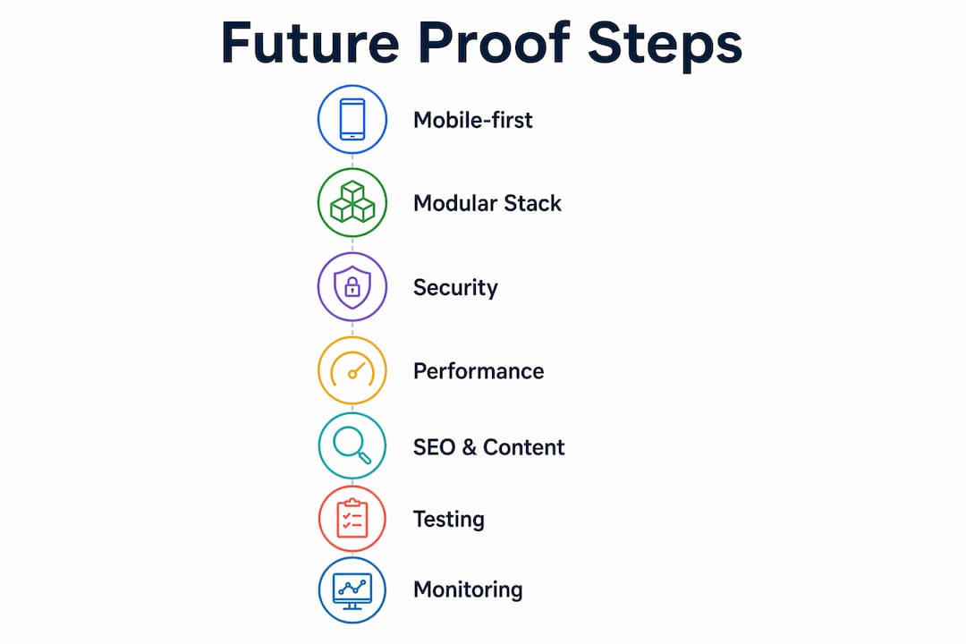
Here are the core features that define a future-proof website:
- Mobile-first, responsive design across all screen sizes
- Modular, API-ready architecture that supports new integrations
- Layered security with regular audits and patching
- Fast load times through caching, compression, and content delivery networks (CDNs)
- Clean, semantic HTML with structured data for SEO
- Accessible design that meets WCAG standards
- Regular content updates managed through a flexible content system
- Monitoring and analytics to guide continuous improvement
1. How mobile-first and responsive design keep your site ready for any device
Mobile-first design means building the smallest-screen experience first, then expanding it for larger viewports. This is not just a design philosophy. It reflects where most web traffic actually comes from, and it forces you to prioritize what matters most on a page before adding complexity.
Responsive and adaptive design use media queries to adjust layouts based on viewport size, resolution, and orientation. Responsive design fluidly reflows a single layout. Adaptive design serves distinct layouts to specific device categories. Both approaches keep your content accessible and visually coherent whether someone visits on a phone, tablet, laptop, or a screen size that does not exist yet.
The SEO benefit is direct. Google indexes the mobile version of your site first, so a site that performs poorly on small screens loses ranking ground regardless of how polished the desktop version looks.
- Use fluid grids and relative units (%, rem, vw) instead of fixed pixel widths
- Set viewport meta tags correctly on every page
- Test layouts at multiple breakpoints, not just common phone sizes
- Compress and serve appropriately sized images per device
- Avoid interstitials and pop-ups that block mobile content
Pro Tip: Apply progressive enhancement by starting with a fully functional, text-based experience, then layering in JavaScript interactions and rich media. This way, your site works for every visitor regardless of browser capability or connection speed.
2. How to choose a technology stack that grows with your business
The technology stack you choose today shapes how much freedom you have in two years. Picking a framework with a strong community, active maintenance, and clear documentation reduces the risk of being stuck on an unsupported platform when you need to scale or integrate new tools.

Modular architecture lets teams update or replace individual components without touching the rest of the platform. This is the practical alternative to monolithic systems, where a single change can ripple into unexpected failures. Pair that with an API-first approach, and your site can connect to CRMs, payment gateways, marketing tools, and future platforms without rebuilding from scratch.
Technical debt is the hidden cost of shortcuts. Clean, well-documented code reduces reliance on specific developers, speeds up debugging, and lowers long-term maintenance costs. Every time you skip documentation or hard-code a value that should be configurable, you are borrowing against future flexibility.
Key criteria for evaluating a technology stack:
- Active community support and a mature ecosystem
- Long-term vendor or open-source maintenance commitments
- Availability of skilled developers in the US market
- Native support for APIs and third-party integrations
- Compatibility with cloud-based hosting and CDN infrastructure
3. What security practices actually protect a growing website
Security built into the foundation costs far less than security bolted on after a breach. As your site handles more users and more data, the attack surface grows. Proactive security measures reduce that risk before it becomes a crisis.
Cyber threats are not slowing down. The FBI’s Internet Crime Complaint Center (IC3) consistently reports billions of dollars in annual losses from cybercrime targeting US businesses. Websites that skip regular security audits are among the most exposed.
The practical security checklist for a future-proof site:
- Enforce HTTPS with TLS encryption across every page and API endpoint
- Use multi-factor authentication for all admin and editor accounts
- Implement role-based access control so users only reach what they need
- Schedule quarterly vulnerability assessments and penetration tests
- Apply security patches within days of release, not weeks
- Monitor server logs for unusual access patterns and failed login attempts
- Encrypt sensitive data both in transit and at rest
Regular audits catch misconfigurations that automated scans miss. A quarterly review of user permissions alone often reveals accounts with far more access than their role requires.
4. Why load speed is a scalability issue, not just a user experience issue
Slow websites struggle under increased traffic. That is not a UX observation. It is a scalability problem. When load times spike during a traffic surge, bounce rates climb and revenue drops. Performance optimization built in from the start means your site handles growth without emergency fixes.
The most impactful techniques:
- Caching: Store static assets and database query results so repeat requests skip expensive processing
- Code minification: Strip whitespace and comments from CSS, JavaScript, and HTML files before serving them
- Asset compression: Use formats like WebP for images and Brotli or Gzip for text-based files
- CDNs: Distribute assets across geographically dispersed servers so users load files from a nearby node
- Lazy loading: Defer images and videos below the fold until the user scrolls toward them
Tools like Google PageSpeed Insights and Lighthouse give you a scored baseline and flag specific issues. Run them monthly, not just at launch. Performance degrades as content grows and third-party scripts accumulate. Check your image optimization practices regularly since uncompressed images are consistently the largest avoidable drag on load time.

5. How SEO best practices keep your site visible as search evolves
SEO-friendly development is not a layer you add after launch. It is a structural decision made during development. Clean URL structures, semantic HTML elements (H1 through H6, article, nav, main), and properly implemented structured data (Schema.org markup) give search engines a clear map of your content.
Voice search changes the equation slightly. Queries spoken aloud tend to be longer and more conversational than typed searches. Structuring content around natural questions and providing direct answers in the first paragraph of each section helps your pages surface in voice results and AI-generated answer summaries.
Accessibility and SEO overlap more than most people realize. Alt text on images, descriptive link text, and logical heading hierarchies all serve both screen readers and search engine crawlers. Treating them as separate concerns means doing the same work twice.
Content scalability matters here too. A site built on a flexible content management system (CMS) lets editors publish and update pages without developer involvement, which means your content stays fresh without creating a bottleneck. For deeper guidance on long-term SEO strategy, the fundamentals have not changed: relevance, authority, and technical health.
6. Why progressive enhancement is the right mindset for ongoing adaptation
Progressive enhancement starts with a solid, accessible core and layers advanced features on top for browsers and devices that can handle them. The base layer works for everyone. The enhancements reward users with modern setups. Nothing breaks for anyone else.
This approach is the practical answer to a web that keeps fragmenting. New browsers, new devices, new assistive technologies, and new connection speeds all create a moving target. Building from the core outward means you are not constantly patching failures at the edges.
Agile development methods fit naturally here. Short iteration cycles, regular testing, and quick deployment of incremental improvements let you respond to emerging opportunities without waiting for a full redesign. The alternative, saving changes for a major version release, creates long gaps where your site falls behind.
Benefits of the progressive enhancement mindset:
- Core content remains accessible regardless of browser or device limitations
- Advanced features can be tested and rolled out independently
- Failures in one layer do not cascade into total site breakdowns
- Teams can ship improvements continuously without destabilizing the whole platform
- Users with older technology are not excluded from your content
Pro Tip: When integrating emerging technologies like AI-powered chat, voice interfaces, or personalization engines, treat them as enhancement layers. Build the page so it works without them first. Add the technology as a feature, not a dependency.
7. How a consistent content strategy keeps your site relevant over time
Content is not a launch deliverable. It is an ongoing responsibility. A site that publishes once and goes quiet loses search rankings, loses returning visitors, and signals to both users and search engines that the business may not be active.
A content management system that non-developers can use is the foundation. When editors can update pages, publish blog posts, and refresh product descriptions without filing a ticket to the dev team, content stays current. Structured content models, where each content type has defined fields rather than a single open text block, make it easier to repurpose content across pages, regions, or formats.
Plan content updates on a schedule, not just when something feels outdated. A quarterly audit of your top-traffic pages identifies which ones have drifted from current information, which ones have lost ranking position, and which ones need a structural refresh. Pair that with a yearly marketing plan that maps content themes to business goals, and you have a system rather than a scramble.
8. Why cross-browser and cross-device testing cannot be skipped
A site that looks perfect in Chrome on a MacBook can break in Safari on an iPhone or render incorrectly in Firefox on Windows. Cross-browser testing is not optional for a site that serves a broad audience. It is the difference between a site that works and a site that works for some people.
The practical approach combines automated and manual testing. Automated tools like BrowserStack or Sauce Labs let you run your pages against dozens of browser and OS combinations without owning every device. Manual testing on real hardware catches interaction issues that automated screenshots miss, particularly on touch interfaces.
Test at every major breakpoint, not just the most common screen sizes. Check form submissions, navigation menus, modal dialogs, and any JavaScript-dependent features across browsers. Regression testing after every significant update catches the cases where a fix in one browser breaks something in another.
A cross-device testing checklist:
- Verify layout integrity at 320px, 768px, 1024px, and 1440px widths
- Test touch interactions on iOS and Android devices
- Check keyboard navigation and focus states in every major browser
- Validate form behavior and error messaging across environments
- Confirm that third-party embeds (maps, videos, payment widgets) load correctly
9. How accessibility compliance protects your business and expands your audience
Web accessibility means building a site that works for people with visual, auditory, motor, and cognitive disabilities. The Web Content Accessibility Guidelines (WCAG) 2.1 at Level AA is the standard most US businesses should target. The Americans with Disabilities Act (ADA) has been applied to websites in federal court cases, making accessibility a legal consideration, not just an ethical one.
The practical implementation is less daunting than it sounds. Semantic HTML handles much of the structural work automatically. Beyond that, the key requirements are:
- Sufficient color contrast between text and background (minimum 4.5:1 ratio for normal text)
- Descriptive alt text on all meaningful images
- Keyboard navigability for every interactive element
- Visible focus indicators so keyboard users know where they are on the page
- Captions or transcripts for video and audio content
- Form labels associated programmatically with their input fields
Accessibility improvements tend to benefit all users, not just those with disabilities. Captions help users watching video in a noisy environment. High contrast helps users in bright sunlight. Clear navigation helps users who are simply in a hurry. For a thorough foundation, Seo-analytic’s accessibility in web design guide covers both the technical requirements and the business case in detail.
10. Why backup and disaster recovery planning belongs in your web strategy
A site going down without a recovery plan is not a technical inconvenience. It is a business interruption. E-commerce sites lose revenue by the minute during downtime. Service businesses lose leads. Every site loses trust.
Backup strategy has three variables: frequency, storage location, and recovery time. Daily automated backups stored in a geographically separate location from your primary server cover most scenarios. Weekly full backups paired with daily incremental backups reduce storage costs while keeping recovery points close together.
Test your backups. A backup that has never been restored is an assumption, not a guarantee. Run a quarterly restoration test to a staging environment to confirm the process works and that the restored site is actually functional. Document the steps so recovery does not depend on one person’s memory during a crisis.
Cloud-based hosting providers like AWS, Google Cloud, and Azure include disaster recovery options as part of their infrastructure, including automated failover and geographic redundancy. If your current hosting setup does not offer these, it is worth reviewing your hosting solution before you need it.
11. How monitoring and analytics drive continuous improvement
You cannot improve what you do not measure. Google Analytics 4, Google Search Console, and server-level monitoring tools together give you a complete picture of how your site performs, where users drop off, and what technical issues are affecting experience or ranking.
Set up alerts for downtime, error rate spikes, and Core Web Vitals regressions. These are the signals that something has gone wrong before users start complaining. Uptime monitoring services check your site every minute and notify you within seconds of an outage.
Analytics data should feed directly into your development roadmap. If a specific page has a high exit rate, investigate whether the content is misaligned with user intent, the page loads slowly, or a broken element is interrupting the experience. Data without action is just noise. The agile marketing approach applies here: short cycles of measurement, hypothesis, change, and re-measurement keep your site improving steadily rather than stagnating between redesigns.
Ready to build a site that lasts?

Seo-analytic helps business owners build websites that are fast, secure, accessible, and built to grow. From initial architecture decisions to ongoing performance monitoring, the team at Seo-analytic brings the technical depth and digital marketing expertise to keep your site competitive year after year. Start with the website building guide to see exactly what a future-ready build looks like, or explore the website building basics for a practical foundation tailored to US business owners.
Key Takeaways
Future proofing your website requires layering security, performance, accessibility, and agile content practices into the site’s foundation, not adding them as afterthoughts.
| Point | Details |
|---|---|
| Mobile-first is the baseline | Build for small screens first; responsive design keeps your site functional on every device, including ones that do not exist yet. |
| Modular architecture reduces risk | Replacing individual components without disrupting the full platform keeps your site adaptable as technology changes. |
| Security needs regular audits | Quarterly vulnerability assessments and prompt patching protect growing sites from evolving threats. |
| Performance affects scalability | Caching, CDNs, and asset compression keep load times fast under increased traffic, not just at launch. |
| Accessibility expands reach | WCAG 2.1 Level AA compliance meets legal standards and makes your site usable for a broader audience. |
FAQ
What does future-proofing a website mean?
Future-proofing a website means designing and building it so it can adapt to new technologies, user expectations, and business needs without requiring a full rebuild. It covers scalability, security, performance, accessibility, and ongoing content strategy.
What is a future-proofing strategy for a website?
A future-proofing strategy combines modular architecture, mobile-first design, layered security, performance optimization, and agile content updates into a continuous improvement process rather than a one-time project.
What does future-proofing your business mean in a digital context?
Future-proofing your business online means aligning your website’s technical foundation with long-term growth plans, so the site supports new products, markets, and integrations without becoming a bottleneck as the business scales.
How often should you audit a future-proof website?
Security audits and performance reviews should run at least quarterly. Cross-browser testing and accessibility checks should follow every major update or new feature release.
Does future-proofing require a complete website rebuild?
Not necessarily. Many future-proofing improvements, such as adding HTTPS, improving image compression, updating semantic HTML, and implementing structured data, can be applied incrementally to an existing site without starting from scratch.