
Most business owners update their websites by swapping fonts, refreshing colors, or rearranging buttons. What they rarely consider is the science behind why those changes work or fail. The gap between an average site and a high-performing one often comes down to psychology, not aesthetics. Average landing page conversion rates sit as low as 2.35%, while the top 10% of sites convert at over 11%. That gap is not accidental. It reflects deliberate design choices rooted in how the human brain processes information, builds trust, and decides to act. This article gives you a clear, practical map for applying those principles to your own site.
Table of Contents
- Why psychology matters in website design
- Core psychological triggers that drive action
- Design frameworks: What works and why
- Practical tips to optimize user experience and conversions
- A fresh perspective: Psychology in website design isn’t just tricks—it’s trust
- Take your website to the next level with expert guidance
- Frequently asked questions
Key Takeaways
| Point | Details |
|---|---|
| First impressions matter | Users form lasting opinions of your website within seconds based on visual aesthetics and layout. |
| Psychological triggers boost conversions | Using color, social proof, and minimal friction can increase conversions by 20-86%. |
| Balanced design is memorable | Websites with the right mix of text and images are easier for users to remember and trust. |
| Small changes yield big results | Minor tweaks like CTA color and form length can dramatically increase user actions and sales. |
| Trust is the long-term win | Building trust through authentic, psychology-driven design leads to sustained growth and loyalty. |
Why psychology matters in website design
First impressions on a website happen in roughly 50 milliseconds. That is not a metaphor. Before a visitor reads a single word, their brain has already formed a judgment about whether your site feels trustworthy, professional, or worth their time. This is why visual hierarchy, the order in which your design guides the eye, is one of the most powerful tools you have.
Here is what the research actually shows about how users experience design:
- First impressions are almost entirely visual and form before conscious thought kicks in
- Memory retention is stronger when design is clean and organized, not cluttered
- Trust is built through aesthetic consistency, not just security badges
- Cognitive load, meaning how hard the brain has to work, directly affects whether users stay or leave
SAPIC designs (sites with a strong aesthetic, picture-dominant, and image-centered layout) create more memorable first impressions than cluttered or text-heavy alternatives. Users remember what they saw, and more importantly, they remember how it made them feel.
“Design is not just what it looks like and feels like. Design is how it works.” This principle applies directly to conversion: a beautiful site that confuses visitors converts poorly, while a clear, psychologically sound layout converts consistently.
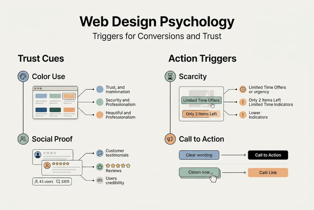
Understanding color psychology in marketing is one entry point into this broader discipline. Color triggers emotional responses before users consciously register them. Blue builds trust. Red creates urgency. Green signals safety. These are not opinions; they are documented patterns in user behavior. When your design aligns with these mental shortcuts, you stop fighting your visitors and start guiding them.
Visual hierarchy works the same way. Placing your most important element, usually your call to action, in a high-contrast position with surrounding white space tells the brain: “this matters.” Users follow the path you set, often without realizing it.
Core psychological triggers that drive action
Once we recognize the deeper mental responses at play, it is helpful to break down the most powerful triggers you can apply right now.
Color and emotional impact is the fastest win. Color choices affect mood, urgency, and perceived credibility. Red CTA buttons outperform green by 21%, and adding testimonials boosts conversions by 34%. These are not minor tweaks. They are measurable shifts in user behavior driven entirely by psychological response.
Here are the core triggers worth building into your design:
- Social proof: Testimonials, star ratings, client logos, and trust badges reduce perceived risk and validate the decision to buy
- Scarcity and urgency: Limited-time offers and low-stock indicators activate FOMO (fear of missing out), pushing users to act now rather than later
- Friction reduction: Every extra form field, confusing label, or slow-loading page is a reason to leave. Removing barriers is as powerful as adding incentives
- Authority signals: Certifications, media mentions, and case studies tell users your brand can be trusted
Pro Tip: Before redesigning your entire site, run a single A/B test on your primary CTA button color. It takes less than a week to gather meaningful data and often produces the highest return of any single change.
Explore conversion optimization tips to see how these triggers apply across different page types, and consider pairing them with A/B testing strategies to validate what works for your specific audience. Psychology gives you the hypothesis; testing gives you the proof.
The mistake most marketers make is treating these triggers as isolated tactics. They work best as a system. Scarcity without trust feels manipulative. Trust without urgency leaves conversions on the table. The combination is what moves people.
Design frameworks: What works and why
Equipped with knowledge of psychological triggers, let’s see how various web frameworks actually measure up in real-world testing.
Researchers studying web design aesthetics have identified several distinct design categories. Three of the most relevant for business sites are SAPIC, SCOFA, and LAPIC.
| Framework | Style | Memory score | Conversion impact |
|---|---|---|---|
| SAPIC | Strong aesthetic, picture-dominant | High | Strong first impression, high recall |
| LAPIC | Large image, picture-centered | High | Excellent for emotional engagement |
| SCOFA | Screen-centered, object-focused | Medium | Functional but less memorable |
Balanced text and image designs achieve the strongest lasting impression and recall. This is not about making your site look like a magazine. It is about giving the brain enough visual anchors to process information without overloading it.
Here is a 3-step checklist for applying a strong design framework to your site:
- Audit your current image-to-text ratio. If pages are mostly text, add one strong, relevant image per section. If pages are mostly images, add clear, concise copy that explains the value.
- Establish a visual hierarchy on every page. Your headline should be the largest element. Your CTA should have the highest contrast. Supporting content should be visually subordinate.
- Remove decorative clutter. Animations, pop-ups, and stock photos that add no meaning increase cognitive load and reduce trust.
Pro Tip: Use a landing page structure comparison to benchmark your current layout against proven frameworks before making changes. Knowing where you start makes it easier to measure progress.
The LAPIC and SAPIC frameworks consistently outperform text-heavy or object-focused designs because they match how the brain naturally processes visual information: images first, then text, then detail. Design with that sequence in mind and your visitors will follow.

Practical tips to optimize user experience and conversions
With a clear sense of what design frameworks perform best, let’s drill down into practical tactics you can use today, backed by hard numbers.
| Tactic | Conversion impact |
|---|---|
| Shorten forms | Up to 20% increase |
| Add explainer video | Up to 86% increase |
| Use red CTA button | 21% better than green |
| Add testimonials | 34% lift |
| Remove navigation from landing pages | Up to 100% improvement in focus |
Shortening forms led to a 20% boost in conversions, and adding videos increased conversions by 86%. These numbers are not theoretical. They come from real tests on real sites.
Here is a practical checklist you can apply this week:
- Visuals: Replace generic stock photos with real product images or team photos
- Headlines: Lead with the user’s problem or desired outcome, not your company name
- CTA color: Test red or orange against your current button color
- Social proof: Add at least three testimonials with names and photos near your primary CTA
- Form fields: Reduce to only what is absolutely necessary for the next step
The biggest pitfall we see is businesses trying to apply every tactic at once. When you change ten things simultaneously, you cannot know what worked. Pick one or two changes, measure the results, then move to the next. This is how you build a site that improves continuously rather than one that gets a big redesign every few years and then stagnates.
Resources like optimized landing pages and guides on how to improve website conversion can help you prioritize which changes to make first based on your current traffic levels and goals.
A fresh perspective: Psychology in website design isn’t just tricks—it’s trust
Here is what most articles on this topic miss: psychological design principles are not manipulation tools. They are alignment tools. When you use scarcity honestly, when your testimonials are real, when your CTA color creates urgency around an offer that genuinely delivers value, you are not tricking anyone. You are removing the friction between what users want and what your site offers.
The businesses that see the biggest long-term gains from psychology-based design are not the ones running the most aggressive tactics. They are the ones whose design tells a consistent, honest story. Users are remarkably good at sensing when something feels off. A countdown timer on a page where the deal never actually expires destroys trust faster than any design element can build it.
We have seen brands double their conversion rates with straightforward changes: cleaner layouts, real testimonials, and CTAs that match what the page actually promises. No gimmicks. The real win from applying conversion strategies rooted in psychology is not a short-term bump. It is a site that earns trust on the first visit and keeps it.
Take your website to the next level with expert guidance
Applying psychological principles to your website is one of the highest-leverage investments you can make in your digital presence. The research is clear, the tactics are proven, and the results are measurable.
Our team at seo-analytic.com has helped business owners across the USA implement these exact strategies through tailored website design and conversion-focused planning. Whether you are starting from scratch or optimizing an existing site, our conversion optimization strategies and website building guide give you a clear path forward. Ready to see what psychology-backed design can do for your numbers? Start with our guide to improve your website conversion rate and take the first real step toward a site that converts.
Frequently asked questions
What is the most important psychological principle in web design?
Trust and ease of use are the most vital. Aesthetic first impressions shape memory and positive design judgments, so users need to feel confident and find information quickly from the very first second.
How can color improve my website’s conversions?
Red CTAs convert 21% better than green, making color one of the simplest and most measurable levers you can pull to improve performance without a full redesign.
Do website testimonials really make a difference?
Yes. Testimonials boost conversions by 34%, building credibility and reducing the perceived risk that holds potential buyers back from committing.
What role do images play in user experience?
Balanced designs achieve higher memory scores, meaning visitors who see well-paired text and images are more likely to remember your brand and return.
Which quick web design changes create the most impact?
Switching CTA color, adding testimonials, shortening forms, and including explainer videos all deliver significant lifts. Form shortening and videos alone raise conversions by 20% to 86% depending on the page.