

TL;DR:
- Effective homepage design centers on a clear value proposition, guiding visitors toward a specific action across all devices. A structured, sequential layout with focused messaging and mobile-friendly navigation enhances engagement and conversion rates. Testing prototypes on real devices and clarifying copy before visual design are essential for optimal performance.
Effective homepage design is the practice of building a user-centered layout that communicates your value proposition, guides visitors toward a specific action, and performs consistently across every device. Your homepage is not a branding exercise. It is a conversion tool, and the gap between a well-designed homepage and a poorly structured one directly determines whether visitors stay or leave. Tools like Webflow, Framer, and research from the Baymard Institute have shaped what we know about high-performing homepages, and the principles are more specific than most designers realize.
What makes effective homepage design work?
The core principle behind any high-converting homepage is that value proposition drives design, not the other way around. Aesthetics matter, but they serve function. When a homepage is built around a clear message, intuitive navigation, and a single primary call to action, every visual decision has a purpose.
Visitors decide within seconds whether to stay or leave. That means your homepage must answer three questions immediately: Who are you? What do you offer? What should I do next? If any of those answers require scrolling or guessing, you have already lost a portion of your audience.
The best homepage layout treats the page as a story with a beginning, middle, and end. Each section earns the next. A visitor who understands your headline is more likely to read your benefits. A visitor who reads your benefits is more likely to trust your social proof. That sequential logic is what separates high-engagement homepages from ones that confuse and repel.
How to structure your homepage layout for clarity and conversion
A conversion-oriented homepage structure follows a clear sequence: header and navigation, hero section with a primary CTA, benefits or features, social proof, content previews, and footer. Each element has a defined role, and placing them out of order disrupts the visitor’s decision-making process.
The table below maps each homepage section to its function and conversion purpose:
| Section | Role | Conversion purpose |
|---|---|---|
| Header/navigation | Orientation and trust | Helps visitors find what they need fast |
| Hero with CTA | First impression and action prompt | Captures intent before visitors scroll away |
| Benefits/features | Justification | Answers “why should I care?” |
| Social proof | Trust building | Reduces skepticism with real evidence |
| Content previews | Depth and engagement | Encourages further exploration of the site |
| Footer | Utility and secondary navigation | Serves returning visitors and edge cases |
Visual hierarchy controls how visitors read this sequence. White space separates sections so the eye knows where one idea ends and another begins. A cluttered layout forces visitors to work harder, and they will not. Keep each section focused on one message, and resist the urge to add secondary CTAs or promotional banners that compete for attention.
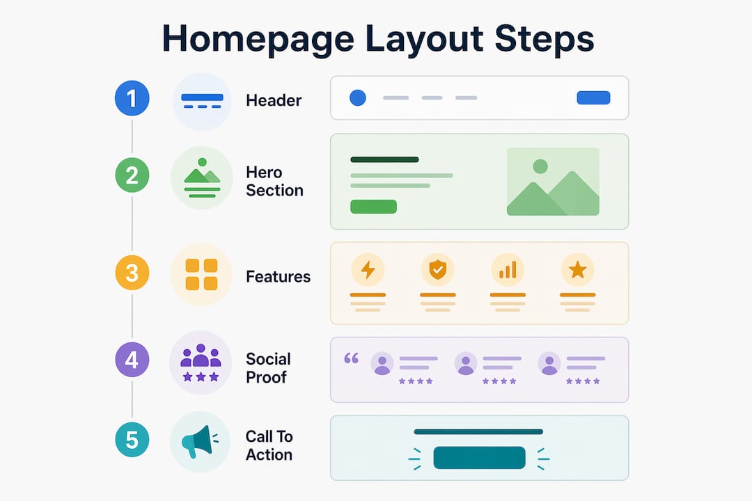
Your headline placement within the hero section is the single most critical layout decision. It must appear above the fold on every screen size, paired with a subheadline that adds context and a CTA button that tells visitors exactly what happens next.
Pro Tip: Before designing anything, write your homepage copy first. The words define the layout. If you cannot write a clear headline and a one-sentence value proposition, no amount of visual design will fix the underlying clarity problem.
What are the key elements of a good homepage?
The difference between a vague headline and a specific one is the difference between a visitor who scrolls and one who clicks. Specific headlines that address real pain points consistently outperform generic ones. “Accounting software for freelancers who hate spreadsheets” beats “Simplify your finances” every time because it speaks to a person, not a category.
Strong CTAs follow the same logic. Action-oriented CTA copy like “Get My Free Quote” outperforms generic labels like “Submit” because it tells the visitor what they receive, not just what they do. Place your primary CTA in the hero section, repeat it after your benefits section, and make it visually distinct from every other element on the page.
Here are the homepage elements that most directly affect engagement and conversion:
- Headline: Specific, audience-targeted, and placed above the fold
- Subheadline: One sentence that adds context to the headline without repeating it
- Primary CTA: Action-oriented copy with a single destination, high contrast color
- Hero image or video: Relevant to your offer, not generic stock photography
- Navigation: Five to six clear, descriptive labels that match what visitors are looking for
- Social proof: Logos, testimonials, or review counts placed near CTAs
- Typography: Consistent font pairing with clear hierarchy between headings and body text
Images deserve special attention. Generic stock photos of smiling people in offices communicate nothing about your business and actively reduce trust. Use product screenshots, real team photos, or custom illustrations that reinforce your value proposition. Visitors process images before they read text, so every visual must support the message, not decorate around it.
Pro Tip: Run your homepage through the five-second test. Show it to someone unfamiliar with your business for five seconds, then ask them what the company does and what they should do next. If they cannot answer both questions, your hierarchy needs work.

How does mobile navigation affect homepage usability?
67% of mobile sites perform poorly in navigation UX, according to Baymard Institute’s 2026 benchmark. That statistic reflects a systemic failure in how designers approach mobile homepages. Most mobile navigation problems are not technical. They are structural decisions made during desktop design that break down on smaller screens.
Mobile-first indexing means Google evaluates your mobile homepage for rankings. Poor mobile usability does not just frustrate visitors. It directly reduces your organic visibility. Responsive homepage design is no longer optional for any business that depends on search traffic.
The most common mobile navigation failures include:
- Hamburger menus with no visible labels, leaving visitors unsure what the icon does
- Sticky headers that consume too much vertical space on small screens
- Menu items with vague or clever labels that do not describe the destination
- Touch targets smaller than 44px, causing mis-taps and frustration
- Carousels that autoplay and cannot be paused, which 46% of homepage carousels fail to implement correctly
For practical guidance on fixing these issues, Seo-analytic’s resource on mobile navigation design covers the most common pitfalls and their solutions in detail. The core fix for most mobile navigation problems is the same: label everything, limit choices, and test on real devices rather than browser simulators.
What is the process for designing and launching a homepage?
Starting a homepage project without a written brief is the most common reason designs fail to convert. A detailed brief that defines your audience, the one action you want visitors to take, and the three messages you must communicate gives every design decision a filter. If a visual element does not serve one of those three messages, it does not belong on the page.
The process that consistently produces high-performing homepages follows these steps:
- Write the brief. Define your audience, primary conversion goal, and core messages before opening any design tool.
- Draft the copy. Write headlines, subheadlines, CTA labels, and benefit statements. Copy defines layout.
- Build a wireframe. Sketch the layout in low fidelity using tools like Figma or Framer. Focus on hierarchy, not styling.
- Create a clickable prototype. Usability issues emerge during prototyping, not during final design. A clickable structure reveals navigation problems that polished visuals hide.
- Test on real devices. Collect feedback on clarity and navigation from people who match your target audience. Ask them what the page is about and where they would click first.
- Refine based on feedback. Fix hierarchy, label, and CTA issues before moving to visual styling.
- Launch with analytics in place. Set up scroll depth tracking, click maps, and conversion events from day one.
Pro Tip: Do not test your homepage with colleagues or clients who already know your business. They will not catch the clarity problems that real visitors encounter. Use a tool like Maze or UserTesting to recruit participants who match your actual audience.
The conversion optimization strategies you apply after launch depend entirely on the data you collect in the first weeks. Build that feedback loop into your process from the start.
Common homepage design mistakes that hurt engagement
The most damaging homepage mistakes share one root cause: trying to do too much at once. Overloaded hero sections with multiple CTAs, animated backgrounds, and competing headlines overwhelm visitors and reduce conversion. Simplicity in the hero section consistently outperforms complexity.
The table below contrasts common mistakes with the corrective approach:
| Mistake | Better practice |
|---|---|
| Multiple CTAs in the hero section | One primary CTA per section, secondary options below the fold |
| Vague headline like “Welcome to our site” | Specific headline addressing a real audience problem |
| Navigation with 10+ menu items | Five to six labeled items covering core visitor needs |
| Generic stock photography | Real product images or custom visuals tied to your offer |
| No mobile testing before launch | Test on iOS and Android devices with real users |
Unclear messaging is the second most common failure. When visitors cannot identify what a business does within three seconds, they leave. The fix is not better design. It is clearer copy. Rewrite your headline before you redesign your layout.
Navigation overload compounds the problem. Visitors presented with too many choices make no choice at all. Limiting top-level menu items and using website navigation best practices reduces cognitive load and keeps visitors moving toward conversion.
Key takeaways
Effective homepage design requires a clear value proposition, a structured layout, and mobile-optimized navigation to convert visitors into customers.
| Point | Details |
|---|---|
| Value proposition first | Design every element around a clear, specific message before choosing visuals. |
| Sequential layout structure | Order sections from header through social proof to guide visitors toward action. |
| Specific CTAs convert better | Use action-oriented copy like “Get My Free Quote” instead of generic labels. |
| Mobile navigation is critical | 67% of mobile sites fail navigation UX; test on real devices before launch. |
| Prototype before you style | Clickable wireframes reveal usability problems that finished designs hide. |
Why I think most homepage redesigns solve the wrong problem
After reviewing hundreds of homepage projects, the pattern I see most often is this: a business spends significant time and budget on visual redesign when the actual problem is copy. The headline is vague, the CTA is generic, and the navigation labels describe internal company structure rather than what visitors are looking for. No amount of new photography or color palette fixes that.
The homepages that perform best are almost always the ones where the designer and the business owner worked through the brief together before touching a design tool. When you know exactly who you are talking to, what they need to hear, and what you want them to do, the layout decisions become obvious. The visual design becomes a delivery mechanism for a message that already works.
Mobile is the other area where I see consistent underinvestment. Designers still build on desktop first and adapt for mobile as an afterthought. In 2026, that approach produces homepages that technically pass responsive checks but fail real users on real devices. Testing on a browser simulator is not the same as testing on an actual iPhone or Android phone with real thumbs and real network conditions.
The best creative homepage ideas are not the most visually complex ones. They are the ones where every element earns its place by serving the visitor’s decision-making process. Start with clarity. Add style second.
— Maayan
Build a homepage that works as hard as you do
If this article gave you a clearer picture of what your homepage needs, the next step is putting that knowledge into practice with the right foundation.

Seo-analytic’s website building basics guide walks US business owners through every foundational decision, from structure and copy to technical setup, so you are not guessing at what matters. For teams focused on mobile performance, the responsive design guide covers the specific adaptations that keep your homepage fast, usable, and visible in search across every screen size. Both resources are built for business owners and designers who want practical direction, not theory.
FAQ
What is effective homepage design?
Effective homepage design is a user-centered layout that communicates a clear value proposition, guides visitors toward a specific action, and performs consistently across devices. It prioritizes conversion goals over aesthetics.
How many CTAs should a homepage have?
A homepage should have one primary CTA in the hero section. Secondary CTAs can appear lower on the page, but each section should present only one clear next step to avoid overwhelming visitors.
Why does mobile navigation matter for homepage performance?
Baymard Institute’s 2026 benchmark found that 67% of mobile sites perform poorly in navigation UX. Poor mobile navigation increases bounce rates and, due to mobile-first indexing, directly reduces search rankings.
What should go in the hero section of a homepage?
The hero section should contain a specific headline, a supporting subheadline, one primary CTA, and a relevant visual. Every element should answer who you are, what you offer, and what the visitor should do next.
How do I test my homepage before launch?
Build a clickable prototype using a tool like Figma or Framer, then test it with real users who match your audience. Collect feedback on clarity and navigation before applying final visual styling.