

Many business owners confuse responsive themes with mobile-friendly websites, missing the crucial distinction that impacts user experience. Responsive themes automatically adapt your entire website layout to any screen size, from smartphones to desktops, using a single codebase. This guide clarifies what responsive themes truly are, how they work, and why they’re essential for your business website in 2026.
Table of Contents
- What Is A Responsive Theme And Why Does It Matter?
- Key Features And Technologies Behind Responsive Themes
- Benefits Of Responsive Themes For Business Websites
- Common Responsive Design Challenges And How To Overcome Them
- Explore Our Expert Website Building Resources
- Frequently Asked Questions
Key takeaways
| Point | Details |
|---|---|
| Responsive themes adapt layouts fluidly | Your website automatically adjusts to all screen sizes without separate mobile versions. |
| Essential for modern user experience | Visitors expect seamless browsing whether they use phones, tablets, or desktops. |
| Boosts SEO and search rankings | Google prioritizes mobile-friendly sites in search results, making responsive design critical. |
| Single codebase reduces costs | Maintaining one responsive site is cheaper and simpler than managing multiple versions. |
| Mobile-first approach wins | Designing for smallest screens first ensures optimal experiences before scaling up. |
What is a responsive theme and why does it matter?
A responsive theme is a website design that fluidly adapts to all devices using a single codebase, automatically adjusting layout, images, and content based on screen size. Unlike creating separate desktop and mobile versions, responsive themes use flexible grids, media queries, and scalable images to deliver optimal viewing on any device.
Three core principles power responsive themes. Fluid grids use percentages instead of fixed pixels, allowing layouts to resize proportionally. Media queries enable CSS to apply different styles based on device characteristics like screen width. Flexible images scale within their containers, preventing overflow or distortion.
Responsive design adapts layouts to ensure optimal viewing across various screen sizes, making it more than just a single technology. It’s a comprehensive approach combining multiple techniques to create seamless experiences. This matters because user expectations for consistency across devices have never been higher.
Why should you care? Responsive themes boost usability by maintaining readability and navigation regardless of device. They ensure visual and functional consistency, strengthening brand perception. When visitors can easily browse your site on any device, engagement rises and bounce rates drop.
“Responsive design isn’t optional anymore. It’s the baseline expectation for professional websites in 2026.”
Our responsive website design guide walks you through implementation strategies. For deeper technical insights, explore our responsive web design explained guide.
Key benefits at a glance:
- Unified experience across all devices
- Improved accessibility for diverse users
- Professional appearance that builds trust
- Simplified content management workflow
Key features and technologies behind responsive themes
Three core technologies enable responsive design: fluid grids, media queries, and flexible images. Understanding these helps you evaluate themes and communicate effectively with developers.
Fluid grids create layouts using relative units like percentages rather than fixed pixels. When screen size changes, elements resize proportionally. A sidebar set to 25% width stays proportional whether viewed on a tablet or phone.
Media queries apply CSS conditionally based on device characteristics like screen width, resolution, and orientation. They’re the backbone enabling different layouts for different contexts. A three-column desktop layout can transform into a single-column mobile stack using media queries.
How responsive features adapt in practice:
- Navigation transformation: Desktop horizontal menus become mobile hamburger icons, keeping navigation accessible without cluttering small screens.
- Content stacking: Multi-column layouts reflow into single columns on narrow screens, maintaining readability.
- Image scaling: Photos resize to fit containers, preventing horizontal scrolling and slow load times.
- Touch-friendly buttons: Click targets expand on mobile devices, accommodating finger taps instead of precise mouse clicks.
- Font adjustments: Text sizes scale up on smaller screens, ensuring comfortable reading without zooming.
Choosing breakpoints based on content layout, not device types, is crucial. Design should break naturally when content becomes hard to read or interact with. Common breakpoints at 768px and 1024px are starting points, but your specific content dictates optimal breaks.
Mobile-first approach means designing for smallest screens first, then progressively enhancing for larger displays. This ensures core functionality works everywhere before adding desktop enhancements. It’s easier to add features than strip them away.

Pro Tip: Test breakpoints by slowly resizing your browser window instead of jumping between preset device widths. This reveals awkward in-between sizes where your layout might break unexpectedly. Content-driven breakpoints prevent layout issues that plague device-based approaches.
Check out our mobile-friendly website tips for business owners for practical implementation advice.
Benefits of responsive themes for business websites
Responsive themes deliver measurable advantages that directly impact your bottom line. Understanding these benefits helps justify investment in quality responsive design.
Enhanced user experience tops the list. Consistent design across devices builds familiarity and trust. Visitors who can easily navigate your site on any device stay longer, explore more pages, and convert at higher rates. Frustrated users facing broken mobile layouts leave immediately.
Search engines favor mobile-friendly responsive websites, giving them SEO advantages. Google uses mobile-friendliness as a ranking signal, meaning non-responsive sites rank lower in search results. With mobile-first indexing, Google primarily uses your mobile site version for ranking and indexing.
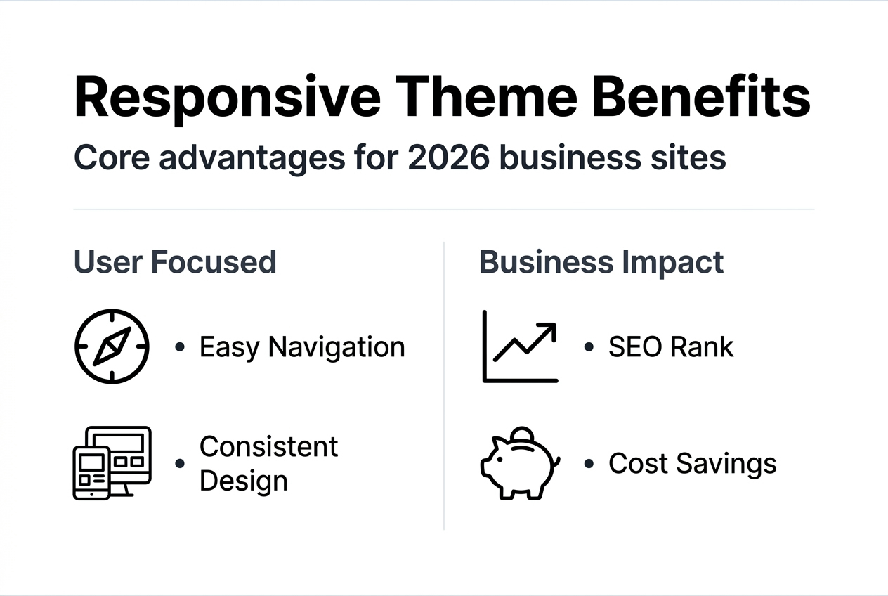
Maintaining one codebase instead of separate desktop and mobile sites saves substantial time and money. Updates happen once and apply everywhere. Bug fixes don’t require duplicate work. Development costs drop significantly over time.
Over 60% of global web traffic now comes from mobile devices, making mobile optimization non-negotiable. Ignoring this majority means losing potential customers to competitors with better mobile experiences.
Future-proofing represents another key advantage. Responsive themes adapt automatically to new device types and screen sizes without redesign. When foldable phones or new tablet formats emerge, your responsive site adjusts naturally.
Business benefits breakdown:
- Higher conversion rates from improved usability
- Better search visibility and organic traffic
- Lower long-term maintenance expenses
- Competitive advantage in mobile-heavy markets
- Reduced bounce rates across all devices
Our guides on why mobile optimization matters and on-page SEO techniques boost rankings provide actionable strategies for maximizing these benefits.
Mobile traffic dominance means mobile-first responsive design targets your majority audience. Designing primarily for desktop in 2026 ignores where most users actually browse. Responsive themes ensure you meet users where they are, on whatever device they choose.
Common responsive design challenges and how to overcome them
Responsive design isn’t without obstacles. Recognizing common pitfalls helps you avoid costly mistakes and implementation delays.
Incorrect breakpoint choices lead to layout issues when designs break at inappropriate screen widths. Basing breakpoints on popular device dimensions creates problems as devices evolve. Instead, let your content determine where layouts should adapt.
Performance issues plague responsive sites when developers neglect optimization, causing slow mobile load times. Large uncompressed images, heavy JavaScript files, and excessive CSS bloat drag down performance. Mobile users on slower connections suffer most.
Managing complex CSS becomes challenging as responsive styles accumulate. Without proper organization and documentation, maintenance becomes a nightmare. Multiple developers struggle to understand and modify tangled stylesheets.
| Problem | Solution |
|---|---|
| Breakpoint errors causing layout breaks | Use content-based breakpoints, test thoroughly across actual size ranges |
| Slow mobile load times | Optimize images, lazy load content, minimize CSS/JS, use CDNs |
| Unmanageable CSS complexity | Implement modular CSS architecture, document breakpoint logic clearly |
| Images not scaling properly | Use responsive image techniques like srcset, ensure max-width 100% |
| Touch targets too small | Design buttons and links minimum 44×44 pixels for comfortable tapping |
Practical optimization techniques:
- Compress images using modern formats like WebP
- Implement lazy loading for below-fold content
- Minimize and concatenate CSS and JavaScript files
- Use browser caching strategically
- Prioritize critical CSS for faster initial render
- Remove unused code and dependencies
Pro Tip: Test your responsive design extensively on real devices, not just browser emulators. Physical devices reveal touch interaction issues, actual load times on cellular networks, and rendering quirks that desktop-based testing misses. Borrow devices from friends or use device testing services before launch.
Our responsive website design guide offers detailed troubleshooting strategies for these common challenges.
Explore our expert website building resources
Understanding responsive themes is just the beginning. Implementing them effectively requires choosing the right platform, configuring settings properly, and optimizing for your specific audience.
Our digital marketing agency specializes in helping US business owners build professional, responsive websites that convert visitors into customers. We’ve developed comprehensive guides covering every aspect of website creation and optimization.
Explore our website building basics for US business owners to start your journey. This step-by-step guide walks you through platform selection, domain registration, and initial setup. For deeper responsive design insights, our responsive website design guide provides technical implementation details.
Need reliable hosting for your responsive site? Check our website hosting services offering optimized performance across all devices. We provide tailored solutions that increase website visits and improve conversion rates, helping your business thrive online.
Frequently asked questions
What is a responsive theme?
A responsive theme is a website design that automatically adjusts its layout, images, and content to fit any screen size using a single codebase. Unlike separate mobile sites, responsive themes use flexible grids and media queries to create seamless experiences across all devices.
How do responsive themes differ from separate mobile sites?
Responsive themes use one codebase that adapts to all devices, while separate mobile sites require maintaining two distinct versions. Responsive design is more cost-effective, easier to maintain, and provides consistent user experiences. Separate mobile sites often create duplicate content issues that hurt SEO.
What are media queries in responsive design?
Media queries are CSS rules that apply different styles based on device characteristics like screen width, resolution, and orientation. They enable your website to display three columns on desktop but stack content vertically on mobile. Media queries are the technical backbone making responsive layouts possible.
What is a fluid grid?
Fluid grids use percentage-based widths instead of fixed pixels, allowing layouts to resize proportionally as screen size changes. A sidebar set to 30% width maintains that proportion whether viewed on a tablet or phone. This flexibility ensures layouts adapt smoothly without breaking.
When should I choose a responsive theme?
Choose a responsive theme whenever building or redesigning any business website in 2026. With mobile traffic exceeding 60% and Google prioritizing mobile-friendly sites in search rankings, responsive design is mandatory for competitive online presence. Our responsive web design explained guide helps you evaluate options.
How do I know if my current theme is responsive?
Resize your browser window slowly from full width to narrow mobile size. A responsive theme adapts smoothly without horizontal scrolling or broken layouts. Alternatively, use Google’s Mobile-Friendly Test tool or check your site on actual mobile devices to verify responsiveness.